
Every business should think about accessibility in email marketing. You want to provide a positive experience to all your subscribers.
But if your emails aren’t crafted with accessibility in mind, a good percentage of your audience with permanent or temporary impairment can’t understand or interact with your emails.
Let’s get started then and work on how to make your emails accessible.
Why Is Email Accessibility Important?
Accessibility refers to the practice of developing and designing tools, websites, and different technologies so that they are accessible to everyone. Accessibility often focuses on people with disabilities or special needs so that they can access and interact with the content.
When you send email campaigns to your subscribers, you want every person to understand them.
Not every person can read your emails in the same way. You need to consider people with visual, physical, cognitive, speech, auditory, and neurological disabilities and provide a positive experience for them as well.
Enter accessibility. Making your emails accessible will make it easier for people to understand and act on your emails.
Here are some statistics to show you the bigger picture on why you need to implement accessibility:
- Over 1 billion people live with some form of disability. – WHO
- Globally, at least 2.2 billion people have a near or distance vision impairment. – WHO
- It is estimated that by 2050 over 700 million people – or one in every ten people – will have disabling hearing loss. – WHO
- According to WebAIM‘s screen reader user survey, 79.5% of those with disabilities rely exclusively on screen reader audio.
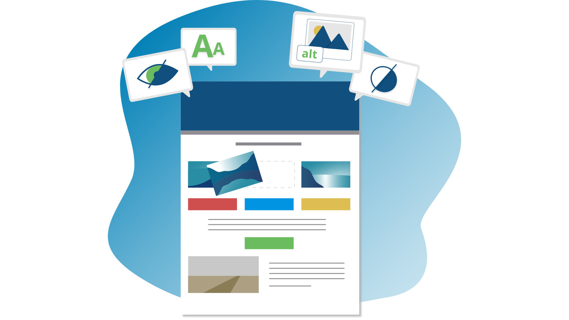
17 Best Practices for Crafting Accessible Emails
Implement the 17 tips below to make your emails accessible to all your subscribers.
1. Follow logical structure
This means that your emails need to be responsive. The email content should be displayed properly regardless of the device (desktop, tablet, or mobile).
Screen readers read aloud content from left to right and from top to bottom. In order not to confuse or disorient users, your emails need to follow a logical structure when displaying content.
If you are using a Loopify template, we take care of this for you. Our templates are responsive and maintain logical order.
2. Choose an accessible typeface
There is no perfect typeface, but some cause more reading difficulties than others. Fancy-looking fonts are all the rage, but think how accessible they are. It can be hard to distinguish between letters and words.
Spacing can be another issue, so choose a typeface that is not too condensed.
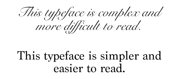
Image via WebAIM
3. Write descriptive subject lines
We’ve mentioned before that descriptive and concise subject lines determine whether a person will open your email or not. They are also good for accessibility because they tell users what the email is about.
4. Have color contrast
Solid color contrast between your text and background is a good practice from a design perspective. But, it also helps people with color blindness to recognize and read your text.
This also means that your button color and text should have good contrast as well. Here’s a useful tool to check your text vs. background contrast ratio.
5. Add alt text for images
Describe your images so that people using screen readers can understand the image and its relation to the email content.
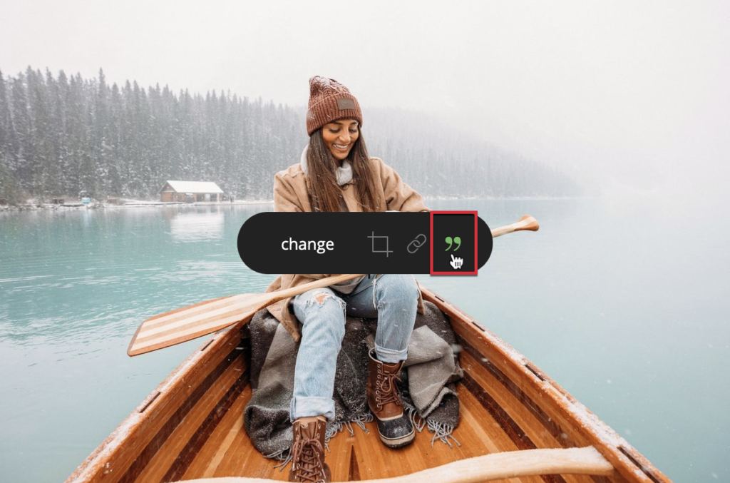
Here’s how you can add alt text to images in Loopify. Hover over any image and click the last icon.
If the image is a link, use alt text to describe where the link leads to. Alt text is also useful when email clients don’t load images properly, users can read what the image is about.
Not all images should have an alt text, though. For the best advice, practices, and how to use alternative text, check the image tutorials by the Web Accessibility Initiative (W3C).
6. Avoid text in images
Screen readers can’t read the text in images. Plus, the text can’t be properly scaled to fit different zoom levels or screen sizes.
One solution will be to type the content as an alt text for the said image. But beware, all email clients don’t handle image blocking and alternative text in the same way.
7. Use a min 14px font size
A universal rule is for your email body text to be at least 14px. I prefer to use 16-18px. Don’t forget that your headings should be bigger to stand out from the rest of the body text.
8. Make links more prominent
Making links and buttons recognizable is essential. You want your subscribers to click them. So, help recipients distinguish them from the regular text and make them easy to find.
Pay attention to:
- Link style. Use colors that stand out from the rest of the text. Avoid using the same color for emphasis. It may confuse people with difficulties as to what is a link and what isn’t. Another tip is to underline and bold all your links as well. Adding a symbol like > or → can also be of big help to recognize links.
- Anchor text. Use a short and descriptive link text to make links accessible to people with low vision and those using screen readers. Don’t use the same link text for multiple links, and avoid using the generic Click here.
- Buttons colors. Buttons that stand out and have good contrast between the button background and button text color can increase the click-through rate.
- Button size. Make them big enough on mobile to be easily clicked by people with physical difficulties.
Tip: If you aren’t sure whether your link contrast passes the accessibility criteria, use a link contrast checker to check it.
9. Align your text
For your subscribers that have dyslexia, it’s very hard to read a center-aligned text. Languages like English are written left to right, so it’s best to left-align your text. Note that there are languages that are written from right to left, like Arabic.
You may have the urge to use justified alignment just for the aesthetic of clean edges. This would be a mistake because the text inside the lines becomes a mess that is hard to read. Plus, justified text in email clients and the web browser is not handled well.
10. Avoid flashy GIFs
GIFs can be a fun way to get your message across. However, flashy GIFs can cause problems for people with photosensitive epilepsy.
If your GIF is on loop, this can be distracting for people with ADHD, so they won’t be able to focus on the rest of the content.
11. Don’t replace words with emojis 🤔
You can use emojis in your emails and subject lines. However, not every client will render them, and in some cases, older versions of email clients won’t load newly added emojis.
So if you use an emoji instead of a word and it doesn’t properly render, your subscribers will miss the point. So use emojis wisely.
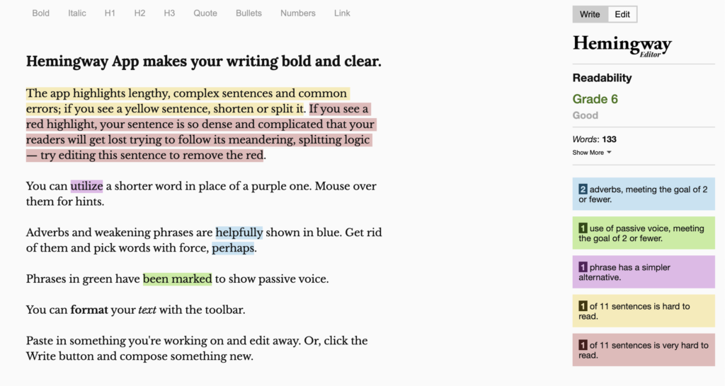
12. Write readable emails
This is not just for accessibility, but in general as well. Write text that is easy to read. You can use tools like Grammarly or Hemingway (both have free options!) to improve your writing and readability score and avoid mistakes.
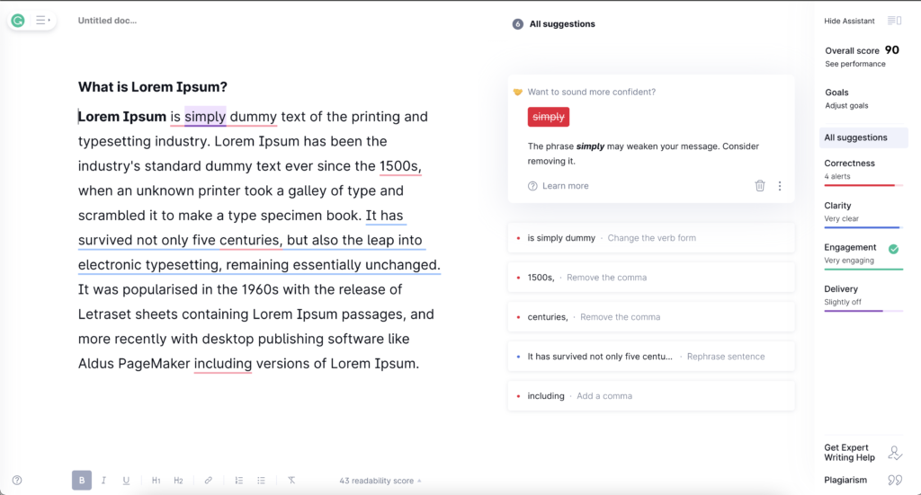
- Use short sentences and avoid adding redundant words.
- Divide your content into scannable paragraphs with headings and split longer paragraphs into shorter ones. Avoid big chunks of text that are difficult to read.
- Using bullet points and lists will make the content easier to consume.
- Your text lines may be too close together. Increase your line height, and it will be easier to read your copy. Don’t forget to adjust the line height for mobile devices.
13. Use plain-text email
Since HTML emails have accessibility issues, many prefer the plain-text version of the email.
The name says it all; plain-text emails are just text. No images, fancy fonts, or hyperlinks. They do not look as pretty as HTML emails but are important for accessibility. Some of the email service providers will autogenerate a plain-text version of your email, but you can create one yourself.
This doesn’t mean that there is no structure to plain-text emails; you want your email to look neat and not a messy chunk of text. Here’s a nice, structured template of a plain-text email created by Litmus that you can use.
Adjust your email code (tips 14 – 17)
The rest of these practices (from 14 to 17) have to do with the way your emails are coded.
This is the technical stuff that you can ask your developer to do or check with the email marketing platform that you are using.
A properly coded email is on the right track when it comes to accessibility; it may just need a few tweaks.
14. Set the HTML language attribute
Some of your subscribers may use a screen reader that turns text into speech. For this reason, it’s better for screen readers to know in what language is the text written so that they can pronounce words correctly.
This is a simple fix by using the lang=”” attribute in the head of the email.
In the Loopify templates, this is always covered as we use lang=”en” for English, but an additional language can always be requested.
15. Use semantic HTML
Your emails should use paragraph <p> and heading <h1> to <h6> tags. These help screen readers to differentiate the text and announce headings and the heading level, for example, “heading level 3”. Plus, they create a better experience for your subscribers.
Here’s a simple example:
<div style="color: #393939; font-family: sans-serif;
  font-size: 16px; line-height: 24px;">
  <h1 style="font-size: 44px; line-height: 66px;">Thanks for joining!</h1>
  <p>We're thrilled about the opportunity to work with you.</p>
  <p>Someone from our team will be in touch with you tomorrow between 10 am - 1 pm.</p>
</div>
16. Set the email title
This is a small fix. The <title> tag will add a title to the browser tab when subscribers open the email in a web browser. It also lets people, who use assistive technology, know what the email is about.
17. Adjust tables
Another great tip for email template developers. Set the table roles to presentation.
Just add the code below to each table:
role="presentation"This way, the screen readers will treat them as regular text elements and not as data tables. If your table contains actual tabular data, then don’t use the role attribute.
Tip: For more detailed information, check out the Web Content Accessibility Guidelines (WCAG) that cover a wide range of recommendations for making Web content more accessible for people with different disabilities and users in general.
In the end, email accessibility isn’t only about improving your email stats and reach. It’s about creating an inclusive experience for all your subscribers. Design and write email campaigns with your subscribers in mind.