
Ready to learn how to use landing pages? This guide will show you why landing pages are a crucial part of your marketing strategy and how to create them.
- Landing Page Basics
- Creating a Converting Landing Page
- Landing Pages and Automation
- How to Create a Landing Page in Loopify
Landing Page Basics
What is a landing page?
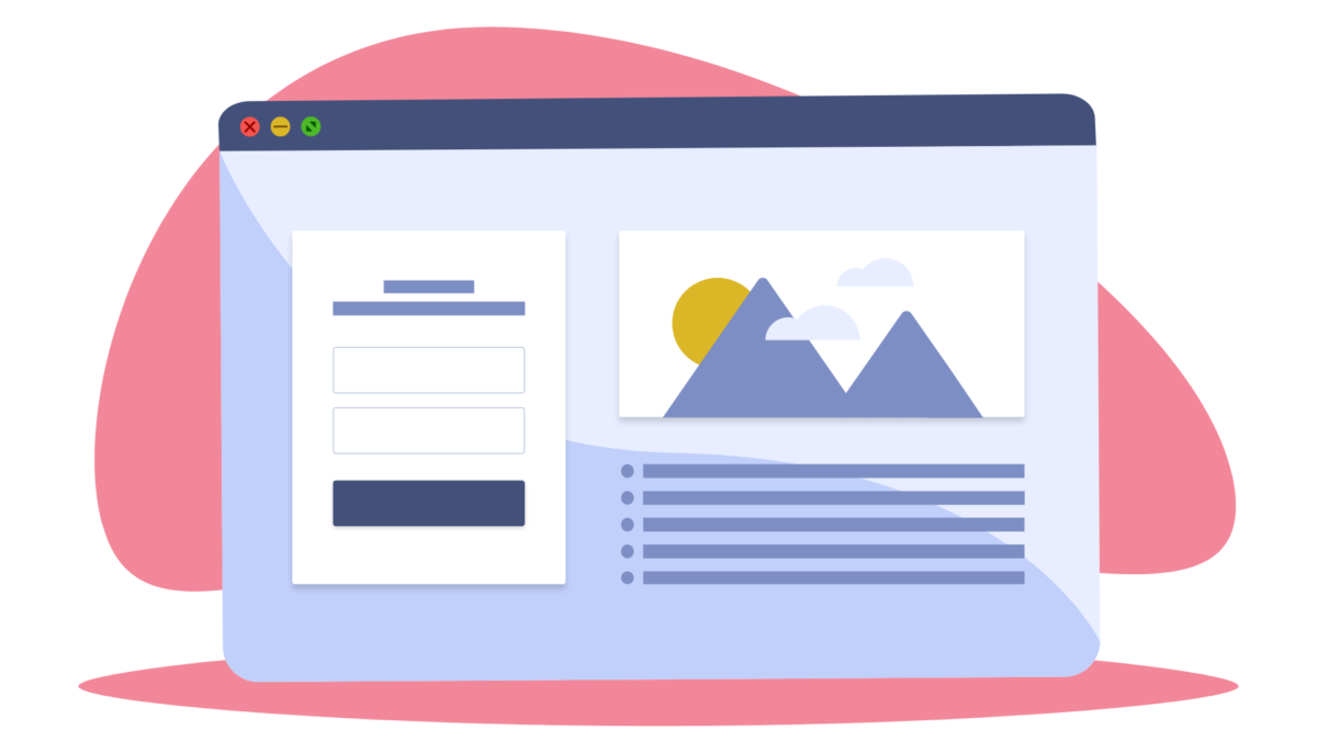
A landing page is a web page whose objective is to convert visitors into leads. There are many types of landing pages, but they all have in common the fact that they are used to capture leads.
5 reasons you need landing pages for your marketing
You may question whether landing pages are vital. After all, you can put your form on your homepage.
That way, you bury your form in a sea of distractions and navigation links that give the perfect exit opportunity to any other page on your website. So the number of conversions can be significantly small.
This is where landing pages come in. They are more concise. Plus, landing pages provide a distraction-free environment focusing on getting visitors to convert. Think of it this way: every landing page element promotes conversion.
If you’re not convinced, here are 5 reasons to use landing pages:
1. Achieve your goals
As a marketer, you’ll work on achieving different goals throughout the year. Whether it’s gathering new leads with a specific campaign or promoting a new product, a landing page designed specifically to achieve that goal will be the way to getting conversions and achieving said goal.
No other webpage will help you achieve the same results, as they have other distractions and several CTA’s. The landing page is specifically designed to help you achieve the specific goal, with all its content and a clear-cut CTA focused on guiding people to take action.
2. Measure the results
Webpages with multiple CTA and traffic sources can be more challenging to measure. If you want to measure a specific goal, it’s best to use a landing page. Want to know how many subscriptions will a specific campaign bring in? Use a landing page. Otherwise, your data will be mixed with people signing up by coming from other sources and campaigns as well.
3. Drive better results from paid ads
It’s a well-known practice that your paid ads should have a dedicated landing page that matches the message, style, and CTA as the paid ads leading to it. Directing your traffic from paid ads to your homepage is a shot in the dark, hoping that your visitors will pick the right action to take when scrolling through your website. Landing pages are designed to convert, focusing on one offer without any other web page’s distracting clutter.
4. More conversions
Because landing pages are focused on one action, your chances for visitors to convert are much higher. For different goals, you need to create separate landing pages.
For example, you need a page for your 2021 survey download, another one for booking a free consultation, a third one for saving a spot for a webinar, etc.
5. Better quality leads
Personalized landing pages are highly successful. Why?
Because your target your audience by their needs or interests. Let say you offer yoga classes. You can have 3 landing pages, one tailored for kids yoga, the second for pregnant women, and the third for advanced classes. You’ll serve each of these yoga benefits that match their needs.
Plus, personalized landing pages can be used at any stage of your customer’s journey, not just to acquire new customers but also to nurture relationships with existing ones.
Tip: Check out when you should use a landing page in your marketing campaigns instead of any other webpage.
Landing page elements
It’s easy to get landing pages mixed up with other web pages like a homepage. So let’s break down its elements and their role to see what separates landing pages from other pages.
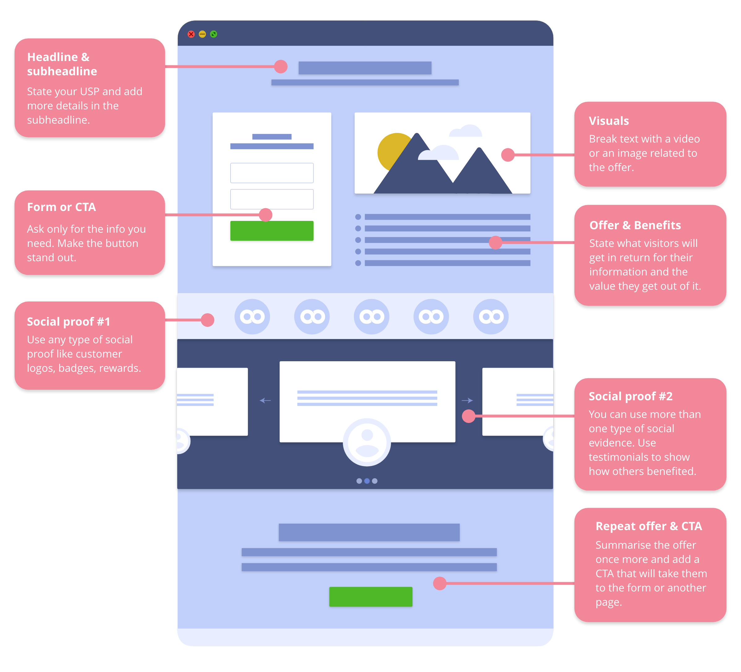
1. Headline and subheadline
The headline and subheadline are where you hook your visitor by telling straight away what you are offering.
- Headline: Here’s where you state your unique selling proposition. 90 percent of visitors who read your headline will also read your CTA.
- Subheadline: Use it to describe the offer in more in-depth detail. While the headline is the hook, the subheadline allows you to elaborate more on the offer’s value.
Now let’s compare two headlines and see which one is better.
Create landing pages with our tool.
or
Guide your visitors on their journey from visitors to leads and customers.
The second one shows how people will benefit from the solution – more conversions and customers. While the first one just states what you can do with the tool feature-wise.
2. Offer and benefits
List the benefits that people will get if they convert. Here’s where you say what they will get in return for leaving their information like email. It’s all about value.
3. Form or CTA
You’ll either have a form that people should fill out or a button that will take them to the page related to the offer. It all depends on your goal. The button and form should stand out.
Unlike a homepage that can promote several CTAs and promote exploration of the rest of the website, landing pages are specific and targeted with one well-defined action in mind.
Tip: It’s a good practice to repeat your main benefit or USP plus the CTA at the bottom of the page to save them from scrolling back to the top.
4. Visual content
Break your text with images or videos related to the offer. This includes photos of your customers, video testimonials, product images, etc.
5. Social proof
You can use one or several types of social evidence to showcase your credibility and customer satisfaction. Add customer logos, reviews, testimonials, badges, rewards to show visitors various reasons why others choose to trust you and why they should too.
Create a Landing Page That Converts
There are 3 main things (or categories) you should focus on to create a landing page to get results.
- Design and structure
- Content and copywriting
- Perzonalization of the message
Let’s start with the page’s design.
Design and structure
Yes, the message takes the center of attention. But, how your page is designed to showcase that message is just as important. If your page is a mess, no one will bother to glance at it.
1. Make it clear and simple
You have eight seconds to make an impression before visitors leave your page.
Make it obvious right away what’s in it for the visitor and how they can get it. Make it as easy as you can to sign up, download or schedule. The fewer steps, the better, which means long forms are a turn-off.
Tip: Put the most important stuff above the fold, like the headline with listed benefits, a form, or a CTA. Any visual like a video testimonial is a plus.
2. Remove or limit navigation
Navigation can be the reason your bounce rate is too high. You are giving people the option to leave the landing page and explore the rest of your website resulting in no conversions. This is the point of a homepage so leave the navigation out of the landing page.
3. Use whitespace
Create skimmable landing pages that don’t crowd the page with too many details. The whitespace balances the text and images.
4. Grab attention with visual content
This can be anything from videos, screenshots of customers, photos or illustrations of the product, e-book, etc. Visual cues that point to the form or CTA are a bonus.
Users are 80 percent more likely to read content combined with bold, attention-getting imagery.
Xerox
Go for visual hierarchy. Follow the flow of visual patterns to guide people to the key points that will get them to click on that CTA button.
Example of loopify arrow
5. Use readable font size
Tiny, tiny text is frustrating to read. And honestly, I don’t bother to read it; just leave the page asap. So your visitors are going to do the same. I prefer an 18px font size, but the generally accepted size is 16px for body text.
You’ll use different font sizes for headlines and legal text, but your starting guide for size should be the body text. Consider how your text looks on mobile as well. That’s a smaller screen than a standard laptop screen.
6. Break up text in bullet points or lists that are easier to digest
You can have more or less text on the page depending on the offer and the commitment it requires from the visitor. To get people to read it:
To get people to read it:
- Make the text skimmable.
- Point the most important details, use bullet points to list benefits, and break up long paragraphs.
- Pay attention to the line space as well.
You don’t want to cram sentences on top of each other.
7. Adjust the color contrast
Colors are essential in any design, and yes, you should use the same colors you have set up in your brand style guide. They help your text and images stand out.
As mentioned many many times before, your background and text should not clash with each other, as well as any other page elements. The wrong color combination can ruin everything, get you no leads no matter how good your offer is. Plus, you are not making it accessible to people with visual impairments.
Tip: If you want to make sure your page’s contrast is good or not, use this tool.
8. Set apart with your branding styles
Your logo, brand colors, and any other styles you use, and tone of voice, should be present on your landing pages. You want people to recognize you immediately and know that they’ve landed on the right destination.
This is why there must be a visual connection between your ads, emails, social posts, and your landing pages. It’s not just the offer that should be the same. The visual aspect should also be.
9. Optimize for mobile-first
If your visitor lands on your page on their mobile, a one-second delay in mobile load times can impact mobile conversion up to 20%. Again, check if the tool you are using has already optimized landing pages that can work on any screen size. You may need to optimize the landing page yourself within the solution.
Make sure that the elements on mobile are not too close together and that they are feasibly clickable on a small screen. Buttons and clickable text should be easy to tap on, font size should be readable, and images and text should not be cut off.
10. Have fast loading time
Your landing pages must load fast. For each extra second that your landing pages load, you are losing more and more visitors.
As page load time goes from one second to 10 seconds, the probability of a mobile site visitor bouncing increases 123%.
Think with Google
So definitely check the page loading time, and if there are any issues, ask your software team to fix them.
11. Make it accessible for screen readers
This is more for the landing pages solution you are using. Accessibility has a lot to do with the way landing pages are coded. Ask if the landing page templates they offer are accessible to users using screen readers.
You can help here by paying attention to the contrast and colors you use and the font size and style, as I mentioned above. Make sure you also add alt text to images and provide explanatory descriptions.
Content and copywriting
1. State a problem you are solving or what people are getting
It’s easy to focus on features and what you do. Honestly, nobody cares unless you state how your offer solves the visitor’s problem. Communicating how you can help make their lives easier will get people to convert instead of listing what you can do.
2. Grammar
Your text should be easy to read, which means short sentences are the way to go. You may have heard this before, write as you talk to a friend. It’s easy to understand, unlike jargon and language that makes me feel like I’m reading a legal document.
Being grammatically correct is also important. You can be informal and fun if that is your brand personality, but typos and errors will make it more challenging to get your point across in a transparent way.
Use a tool that catches any grammatical mistakes. In the long run, you’ll improve your writing and fix your grammar and spelling in time.
3. Benefits over features
This is the offer that the landing page revolves about. List the major benefits of your offer and state your unique selling proposition (USP) across the landing page.
Putting multiple offers on your landing page can decrease conversions by up to 266%.
Bluleadz
One offer is easier to focus on and doesn’t distract your visitors. If you have multiple offers, create multiple landing pages for each one. And then target people depending on the offer they would be interested in.
4. Clear CTA
Include these above the fold, then repeat the CTA at the button of the page. This is the action you want your visitor to take.
You can repeat your CTA throughout the page; usually, you’ll find a second button at the end of the page so people won’t need to scroll to the top.
5. Short and concise text
Don’t get carried away with lengthy introductions and essay-like stories. Get straight to the point and make it clear what you expect the visitor to do, like download a survey, sign up for a newsletter, fill out a survey, etc.
6. Social proof
Providing any social proof increases your chances for conversions. Social proof includes clients’ logos, testimonials, reviews, badges, awards, any numbers or stats.
88% of consumers trust testimonials and reviews.
Search Engine Land
They make you trustworthy and assure visitors that you are a legitimate business.
7. Ask only what you need
Asking for too much information on your form can be a huge turn-off for potential leads. We live in a time where privacy concerns increase, and many of us are wary of sharing personal information. Especially if the offer’s benefits do not outweigh the commitment, you are asking from them.
A simple download should not ask for more than an email. If you add fields like phone number and address, you ask for unnecessary information related to a PDF that they will receive via email. And people won’t be willing to give it up, so you’ll lose potential leads that are, in fact, interested in your e-book but won’t commit just because you are asking for too much.
Beware of some mistakes that can cost you conversions and increase your bounce rate. Here’s which mistakes you should avoid.
Personalization
How much of your landing page will be personalized depends on the goal and audience for that specific page.
Some pages will be the same for all visitors, while others should be customized. Other campaigns will require creating two or three separate landing pages depending on who you are targeting.
Now let’s see the reasons for segmenting a landing page.
Why should you segment your landing page?
Segmenting parts of your landing page will allow you to target different types of customers (segments) with only one landing page. This is how you create a dynamic landing page whose content will change based on which type of visitor is landing on it. The result of segmentation is a personalized landing page tailored to each customer.
Here are 3 reasons to segment your landing page:
1. Better personalization
By segmenting both your audience and your content, you will be able to improve your targeting. You can tailor your offer based on your customer’s past purchases, behavior, or interests. So instead of throwing the same offer to everyone and hoping that someone bites, you personalize the offer to get more conversions.
2. Targeted offers to nurture relationships
Personalizing an offer can increase the number of conversions you get because you serve people what they need and are interested in.
Let’s say you do English language tutoring online. Your students can be in different grades, and you may also tutor adults and people who study English as a second language.
You can put out separate ads for lessons for elementary and high school children, adult, and ESL students. The corresponding landing page will be tailored to each of these audiences, with the punchline tweaked to get the attention of each.
3. Cater to different audiences
Dynamic landing pages allow you to adjust your offer for different audiences. Creating dynamic content will save you time by focusing on a single landing page instead of recreating the same landing page all over again.
You choose who sees what, which means you select how your visitors see your offer.
If you know your audience is divided into cat and dog owners, you can personalize the promotional offers instead of stating that you sell pet food and accessories and send it to everyone. Create a dynamic landing page so that cat lovers will see cat food and toys selection; your dog owners will see puppy food, dog toys, and accessories. This can increase sales and engagement because you made it easier and catered to their interests.
How to create dynamic content with Loopify
Step 1: Divide your audience into segments
It’s important to have your audience divided into separate segments before creating dynamic content. You must have the segments to be able to choose what different audiences see. So organizing your contact data properly is the key to your campaign success and all marketing activities.
Step 2: Choose the part you wish to personalize
Usually, you don’t need to personalize the entire landing page. You use the contacts data to address the right customer. Here’s where variables or dynamic contact data come in.
You can choose to tailor an entire section by showing a tailored offer to customers depending on the segment they belong in. For example, English students will see a different orientation schedule than law students.
Step 3: Select who should see it
Start by creating the content for segment by segment. Let’s take the example above. Create the orientation schedule for the language department, then select the law department students and create their schedule, then the engineering, and so on. You basically stack one section on top of the other for different departments.
Step 4: Add as many as you need for as many different segments
You can create as many different versions of the dynamic content as you have departments.
You add the different offers, images, or content as you go. Once you are done, you can select students from various departments to make sure they view the correct text. Creating dynamic content saves you the time you’ll need to create a separate landing page for all different departments.
Step 5: Test the dynamic content before sending
It’s important to remember that you must test to ensure there aren’t any mix-ups. You wouldn’t want to send the law students the itinerary for engineering. Better to be safe than sorry and have to fix the entire situation.
Select contacts from different segments and see how the dynamic content changes within the email. If everything looks okay, you can go ahead and send your email. If not, go over your segments.
- Are the contacts in the right segment?
- Is the segment paired with the correct text and images they should see?
In the end, as always, go over your entire campaign by sending test emails.
Landing Pages and Automation
Landing pages are usually connected to some type of campaign.
Whether they’re a part of a paid ad campaign or a simple survey download with a confirmation email as a follow-up. The form-submit process and confirmation email are part of an automated campaign you set up so that every time someone fills out your form, they get an email.
This is what basic automation is about.
Combine landing pages with other channels
Landing pages are meant to be a part of your cross-channel strategy. We mentioned that you could use landing pages combined with paid ads as your post-click destination.
Here are 6 ways you can send traffic to a landing page:
- Emails – Link to landing pages from your newsletters, event invitations, special promotion emails, or loyalty reward program campaigns.
- Text messages – all links in texts are short links. So you don’t have to worry about that link wasting all your credits. Texts are a great opportunity to link to landing pages for more information since the space is so limited with SMS communication.
- Direct mail – Yes, you can add links in printed communication. It’s going to be a short link that people can easily type in their browser, or even better, use a QR code that people can scan and go to the page to see the offer in detail and leave their contact info.
- Blog posts – Choose a blog topic that ties in with your landing page goal. You can add a button in your 2021 survey post for people to download it. This will take them to a landing page where they’ll give you their information (like email) in exchange for the pdf of the survey. And there’s your new lead.
- Social media – You can use your organic posts as a source of traffic for landing pages. Not every campaign has to be a paid social ad to be able to link to a landing page.
- Paid ads – Pair your paid campaigns with landing pages specifically designed to achieve the goal of the campaign.
Use a thank you page
Thank you pages are underrated. Once people submit your form, you can use your landing page to get additional value out of that lead. Suggest more related reading material, ask people to follow you on social media, suggest more e-book they may be interested in, and more.
All you need to do is choose to load a separate landing page once people have submitted the form.
You can design your thank you page to bring you more conversions or traffic. Ask people to follow you on social media, subscribe to your newsletter, download related e-books, or learn more about the related topic.
What to track
This should be a part of your goal-setting stage. You can track a few things, but the most important metric will depend on the campaign objective.
- Visits – this is the number of people that have landed on the page.
- Form submits – This is the number of people submitting your form. If you want to see your conversion rate, divide the number of form submits by the number of visits and multiply by 100.
- Link clicks – This is the number of people that have clicked a link on your page. To calculate the click-through rate (CTR), divide the number of visits by the number of link clicks and multiply it by 100.
Example: 500 visits and 50 link clicks equal a 10% CTR. 500 visits and 25 form submissions is a 5% conversion rate.
Tip: In Loopify’s page reports, you can also see a list of unique contacts that visited the page, which links they clicked. The best part is that you can add or remove these contacts from different segments, tag them or export them as a .csv or excel file.
How to Create a Landing Page in Loopify
There are 7 steps to create and publish a landing page in Loopify. Here are the steps from start to finish:
1. Set your goal
Before you start any campaign, setting a goal comes as a first step. This will guide you through the entire campaign creation process, whether it’s a simple email campaign or more advanced automation that includes several landing pages.
2. Choose a template
Find a template with all the main elements you need to create a page; you can remove the extra sections you don’t need and rearrange the order to fit the goal. You can choose to change the design of the form and template to suit your campaign aesthetic.
3. Add text and visuals
Craft the best and most persuasive headline and offer text you can. Fix up the font sizes, colors, and text-align to make it easily skimmable. Add your logo and change any background colors to separate sections, and make sure your offer pops up from the rest.
Choose the visual content you’ll use. It can be your uploaded brand images, or pick one of the Unsplash stock photos we offer for free. Don’t forget to add alt text to each image for accessibility purposes and if your image doesn’t load.
4. Add the social proof
First, select the module that fits the type of social proof you’ll add. Choose an image and/or text module for a testimonial. Add the images of your customers if you have and copy the review. State the name of the person and the company they are from.
5. Add a CTA or a form
Depending on your objective, you can have a CTA that links to another page or a form that captures conversions.
A word of advice, add the button at the bottom of the page if there’s a lot of scrolling involved. You can also repeat the form or add a button that takes people right back to the top to complete the form.
Tip: If you have a form, ask only for the information you need. The more fields you have, the less likely are people to share their personal data.
6. Add sharing details
This is a small but meaningful detail to your landing page. Add the title, meta description, and image for your page link to optimize your link preview for sharing.
7. Add to flow and choose privacy
Flows are the automations in Loopify. You must add your page to a flow and go live so that your landing page can be live.
Before you go live, choose the privacy of the page. This means you can choose who can see the page depending on the campaign. Here’s what you can choose from:
- Totally open landing page – search engines can find and rank the newly created page.
- Public link – the page will not be searchable but will be accessible to all those who have the page’s URL.
- Personal link – the page will only be reachable by a personal link sent through other means of Loopify communication (the Email, Print, or SMS app).
- Password protected – the page is not searchable, and visitors will need a password to access it, which you will create and provide to those that should have access to it.
All in all, landing pages will be the reason you get more leads and conversions. Make them a part of your marketing strategy and use them in your campaigns to get better results. Devote time on their goal, design, message, and make it simple and easy to convert to get the most out of your pages.
Sign up today and create your landing pages for free.